Inspired by…La La Land
So I finally watched La La Land! This is my life...watching Oscar nominated a year late. I had heard rumblings that it was overhyped but I really liked it. I mean...it's a musical and stars Ryan Gosling - what's not to love!?
But my favorite part were the colors! They were insanely gorgeous- so many beautiful jewel tones and primary colors throughout. From the fashion to the furniture to the landscape. This article from the LA Times is fascinating, explaining the techniques used to get such vibrant, technicolor-esque color. And I loved the LA vintage vibes shown through the houses, decor, and even the opening scene with all the cars. I started thinking about what a home or room might look like if it were designed around the movie. Here are a few that I think fit the bill.
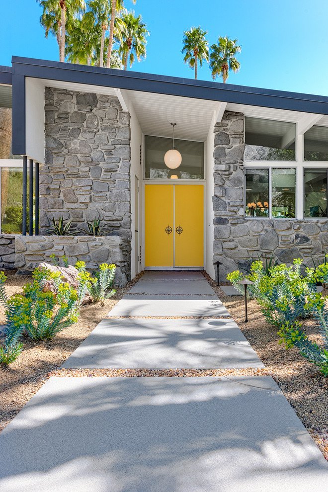
A pop of yellow says "welcome - now let's have some fun" at this Palm Springs home.
Image via Architecture Art Designs
A red door plus a classic Slim Aarons photograph make this one happy entryway. Side note - make sure to check out the before and afters of this project here. Incredible!
Image via Contemporist
More subdued in color. I picture a more mature Sebastian and Mia living here after they "made it"....sigh.
Image via Pinterest
I mean BAM. Talk about color. This reminds me of a less feminine version of Mia and her friend's apartment.
Image via One KIndesign
If you haven't seen the movie, do it. For the color alone it's worth it (and obviously Ryan Gosling too) - Enjoy!


